NABK
About
Contact
Resume
All The Jazz
Project Background
Project Duration
February - March 2024
My Role
Sole UX Designer, Researcher, Writer & Tester
The Problem
Streaming music hardly helps the real creators of the music fans love. Streaming also means that users don’t own the music, and if the streaming service goes down, they get nothing.
The Goal
- Allowing users to pre-order music from bands directly in both physical and digital form.
- Get news about the latest releases.
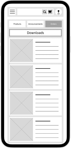
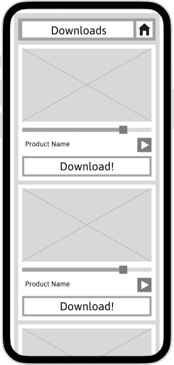
- Track their orders and get downloads from the app itself.
Skip To Final Prototype
Check out my process for this project if you wish to, but if you want to skip directly to the results; check out this prototype to see how it turned out.
App Prototype
Research Phase
Preliminary Research On Potential Users
I talked to some music enthusiasts and also went through the services offered by various streaming services and marketplaces that offer merchandise from bands.
The following are the two personas I was able to create based on what I learned, and their needs.
User Personas

Sarah
Music enthusiast on a budget
"I would expect the app to keep the best interests of the artists at heart, and also ensure users get faultless shipping and service."

Matthew
Vintage music collecter
"If I am in the mood for music, I find my cassettes labeled for that mood and listen to it in it's entirety. I believe a listening session should have a definite end. Instead of it streaming endlessly."
User Pain Points
01
Service
By far the most frequent point from interviewees was about the shipping and quality control provided by the app.
02
Honesty
Users want clarity around the ordering process and about refunds, and additional charges like shipping.
03
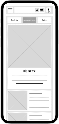
News
Users are often too busy with their daily lives to actively keep up with what goes on with band releases, so they would appreciate a news portal.
04
Individual Preference
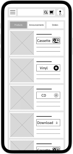
Different users like different forms of media for convenience and nostalgic reasons. The app must offer multiple options like CDs, vinyls, and cassettes.
Early Design Phase
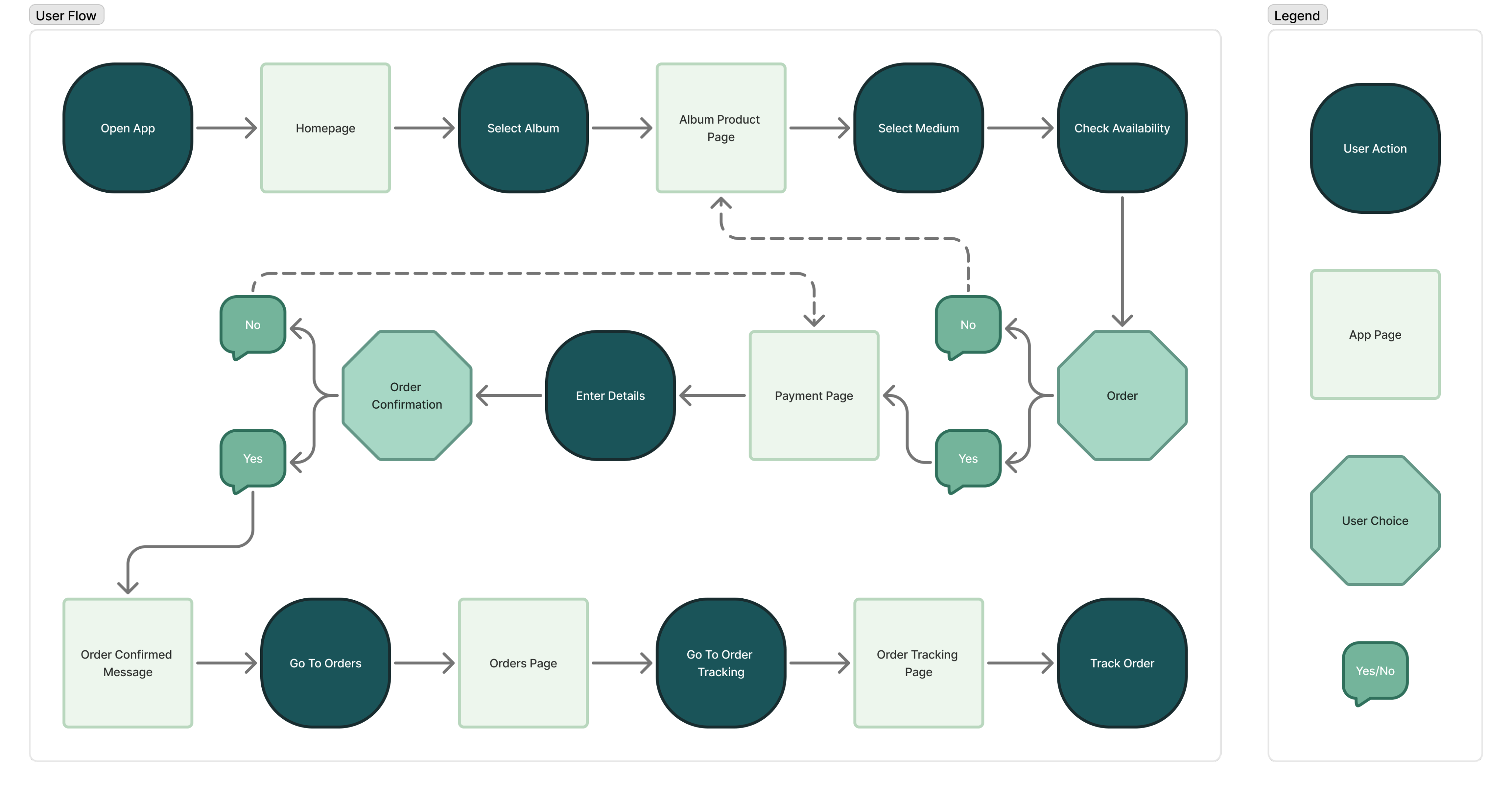
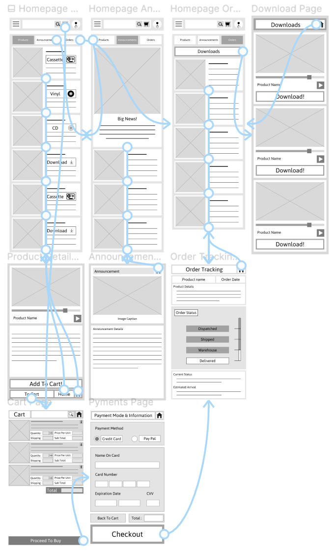
User Flow Diagram
App Wireframes
Low Fidelity Prototype
App Prototype
Usability Study
Usability Study Details

Study Type:
Unmoderated Usability Study

Location:
India, Conducted Remotely

Participants:
5 Participants

Length:
60 Minutes
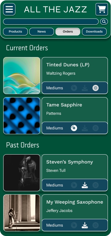
Study Round 1 Findings
01
Order Tracking
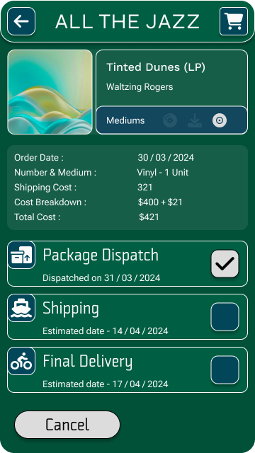
Users found the order tracking page to be convoluted and ineffective.
02
Layout
Users said the layout was confusing and inelegant.
03
Copy
The apps copy-writing needed work since users were unsure about a lot of the labels used.
Study Round 2 Findings
01
Order Tracking
The new order tracking system works much better and users were satisfied with it.
02
Layout
App Layout still needed work but lots of the improvements were working well.
03
Copy
Had no complaints about the language used anymore
Late Design Phase
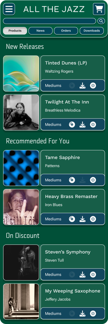
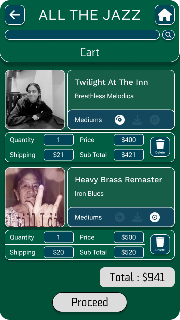
App Mockups
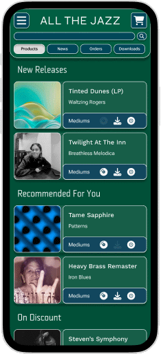
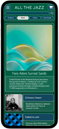
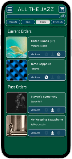
High Fidelity Prototype
App Prototype
Back To Hompage
Scroll To Top
NABK
About Me
Contact Me
My Resume
All The Jazz
Project Background
Project Duration
February - March 2024
My Role
Sole UX Designer, Researcher, Writer & Tester
The Problem
Streaming music hardly helps the real creators of the music fans love. Streaming also means that users don’t own the music, and if the streaming service goes down, they get nothing.
The Goal
- Allowing users to pre-order music from bands directly in both physical and digital form.
- Get news about the latest releases.
- Track their orders and get downloads from the app itself.
Skip To Final Prototype
Check out my process for this project if you wish to, but if you want to skip directly to the results; check out this prototype to see how it turned out.
App Prototype
Research Phase
Preliminary Research On Potential Users
I talked to some music enthusiasts and also went through the services offered by various streaming services and marketplaces that offer merchandise from bands.
The following are the two personas I was able to create based on what I learned, and their needs.
User Personas
Sarah
Music enthusiast on a budget
"I would expect the app to keep the best interests of the artists at heart, and also ensure users get faultless shipping and service."
Matthew
Vintage music collecter
"If I am in the mood for music, I find my cassettes labeled for that mood and listen to it in it's entirety. I believe a listening session should have a definite end. Instead of it streaming endlessly."
User Pain Points
01
Service
By far the most frequent point from interviewees was about the shipping and quality control provided by the app.
02
Honesty
Users want clarity around the ordering process and about refunds, and additional charges like shipping.
03
News
Users are often too busy with their daily lives to actively keep up with what goes on with band releases, so they would appreciate a news portal.
04
Individual Preference
Different users like different forms of media for convenience and nostalgic reasons. The app must offer multiple options like CDs, vinyls, and cassettes.
Early Design Phase
User Flow Diagram
App Wireframes
Low Fidelity Prototype
App Prototype
Usability Study
Usability Study Details
Study Type:
Unmoderated Usability Study
Location:
India, Conducted Remotely
Participants:
5 Participants
Length:
60 Minutes
Study Round 1 Findings
01
Order Tracking
Users found the order tracking page to be convoluted and ineffective.
02
Layout
Users said the layout was confusing and inelegant.
03
Copy
The apps copy-writing needed work since users were unsure about a lot of the labels used.
Study Round 2 Findings
01
Order Tracking
The new order tracking system works much better and users were satisfied with it.
02
Layout
App Layout still needed work but lots of the improvements were working well.
03
Copy
Had no complaints about the language used anymore
Late Design Phase
App Mockups
High Fidelity Prototype
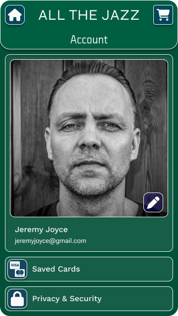
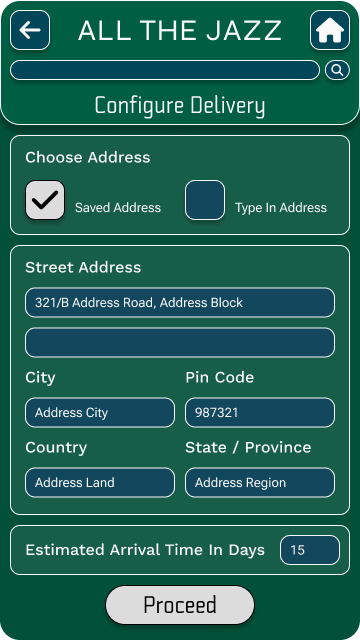
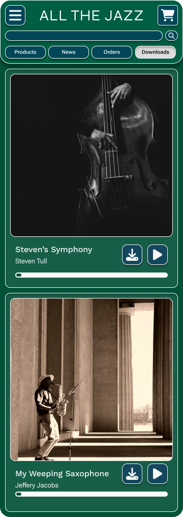
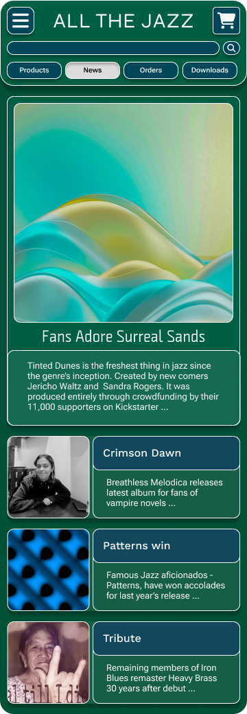
App Prototype
Finale
Accessibility Considerations
01
Colours
I decided the theme and palette by following the WCAG accessibility guidelines. All contrast ratios were over 4:1.
I also wanted the colors to be a bit playful and reflect the artsy nature of the products.
02
Typography
I used only serif fonts for readability and clear hierarchy was established using varying sizes of text and elevated or recessed cards and buttons.
03
Usability Feedback
I made sure to include a partially visually impaired participant whose feedback helped me make the app accessible to as many people as possible.
Conclusions
01
Impact
Though this was only a case study, and my first one, I think if such an app existed, with a broader range of products, it would serve people well.
It would meet the need for people to actually own the media they consume, something existing market leaders in the music space are not interested in providing, in today’s strange online landscape.
02
What I Learned
- This was my first time dabbling in UI/UX in a serious and comprehensive manner, and I must say, I had no idea it was such a deep topic.
- I have learnt a lot about the basics such as, research, designing, Figma, and Prototyping; but there is still much ground to cover.
Back To Hompage
Scroll To Top
NABK
All The Jazz
Project Background
Project Duration
February - March 2024
My Role
Sole UX Designer, Researcher, Writer & Tester
The Problem
Streaming music hardly helps the real creators of the music fans love. Streaming also means that users don’t own the music, and if the streaming service goes down, they get nothing.
The Goal
- Allowing users to pre-order music from bands directly in both physical and digital form.
- Get news about the latest releases.
- Track their orders and get downloads from the app itself.
Skip To Final Prototype
Check out my process for this project if you wish to, but if you want to skip directly to the results; check out this prototype to see how it turned out.
App Prototype
Research Phase
Preliminary Research On Potential Users
I talked to some music enthusiasts and also went through the services offered by various streaming services and marketplaces that offer merchandise from bands.
The following are the two personas I was able to create based on what I learned, and their needs.
User Personas
Sarah
Music enthusiast on a budget
"I would expect the app to keep the best interests of the artists at heart, and also ensure users get faultless shipping and service."
Matthew
Vintage music collecter
"If I am in the mood for music, I find my cassettes labeled for that mood and listen to it in it's entirety. I believe a listening session should have a definite end. Instead of it streaming endlessly."
User Pain Points
01
Service
By far the most frequent point from interviewees was about the shipping and quality control provided by the app.
02
Honesty
Users want clarity around the ordering process and about refunds, and additional charges like shipping.
03
News
Users are often too busy with their daily lives to actively keep up with what goes on with band releases, so they would appreciate a news portal.
04
Individual Preference
Different users like different forms of media for convenience and nostalgic reasons. The app must offer multiple options like CDs, vinyls, and cassettes.
Early Design Phase
User Flow Diagram
App Wireframes
Low Fidelity Prototype
App Prototype
Usability Study
Usability Study Details
Study Type:
Unmoderated Usability Study
Location:
India, Conducted Remotely
Participants:
5 Participants
Length:
60 Minutes
Study Round 1 Findings
01
Order Tracking
Users found the order tracking page to be convoluted and ineffective.
02
Layout
Users said the layout was confusing and inelegant.
03
Copy
The apps copy-writing needed work since users were unsure about a lot of the labels used.
Study Round 2 Findings
01
Order Tracking
The new order tracking system works much better and users were satisfied with it.
02
Layout
App Layout still needed work but lots of the improvements were working well.
03
Copy
Had no complaints about the language used anymore
Late Design Phase
App Mockups
High Fidelity Prototype
App Prototype
Finale
Accessibility Considerations
01
Colours
I decided the theme and palette by following the WCAG accessibility guidelines. All contrast ratios were over 4:1.
I also wanted the colors to be a bit playful and reflect the artsy nature of the products.
02
Typography
I used only serif fonts for readability and clear hierarchy was established using varying sizes of text and elevated or recessed cards and buttons.
03
Usability Feedback
I made sure to include a partially visually impaired participant whose feedback helped me make the app accessible to as many people as possible.
Conclusions
01
Impact
Though this was only a case study, and my first one, I think if such an app existed, with a broader range of products, it would serve people well.
It would meet the need for people to actually own the media they consume, something existing market leaders in the music space are not interested in providing, in today’s strange online landscape.
02
What I Learned
- This was my first time dabbling in UI/UX in a serious and comprehensive manner, and I must say, I had no idea it was such a deep topic.
- I have learnt a lot about the basics such as, research, designing, Figma, and Prototyping; but there is still much ground to cover.
Back To Hompage
Scroll To Top